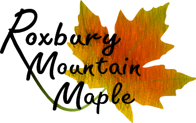
The longest running project in my history as a graphic designer is my work for Roxbury Mountain Maple in Hobart, NY. The Holscher family, who own and run the place, are old friends of my family’s, and they took a chance on my budding design aspirations to let me brand their company when my idea of a maple logo looked like this:
Not bad, perhaps, for an young amateur in 2010 if you look at it with a charitable eye. But despite the lack of polish, the Holschers stuck with me, and throughout the years I had the chance to work on several iterations of their website, a couple brand refreshes, and–my favorite–their label design.
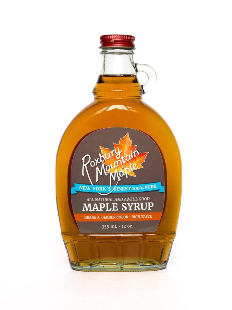
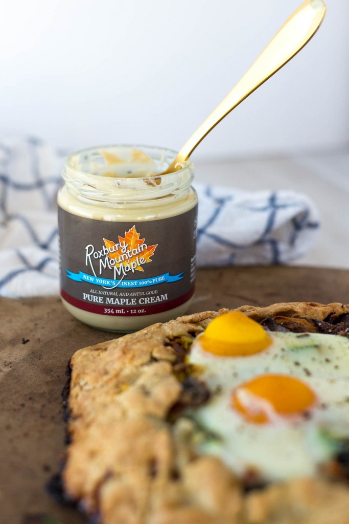
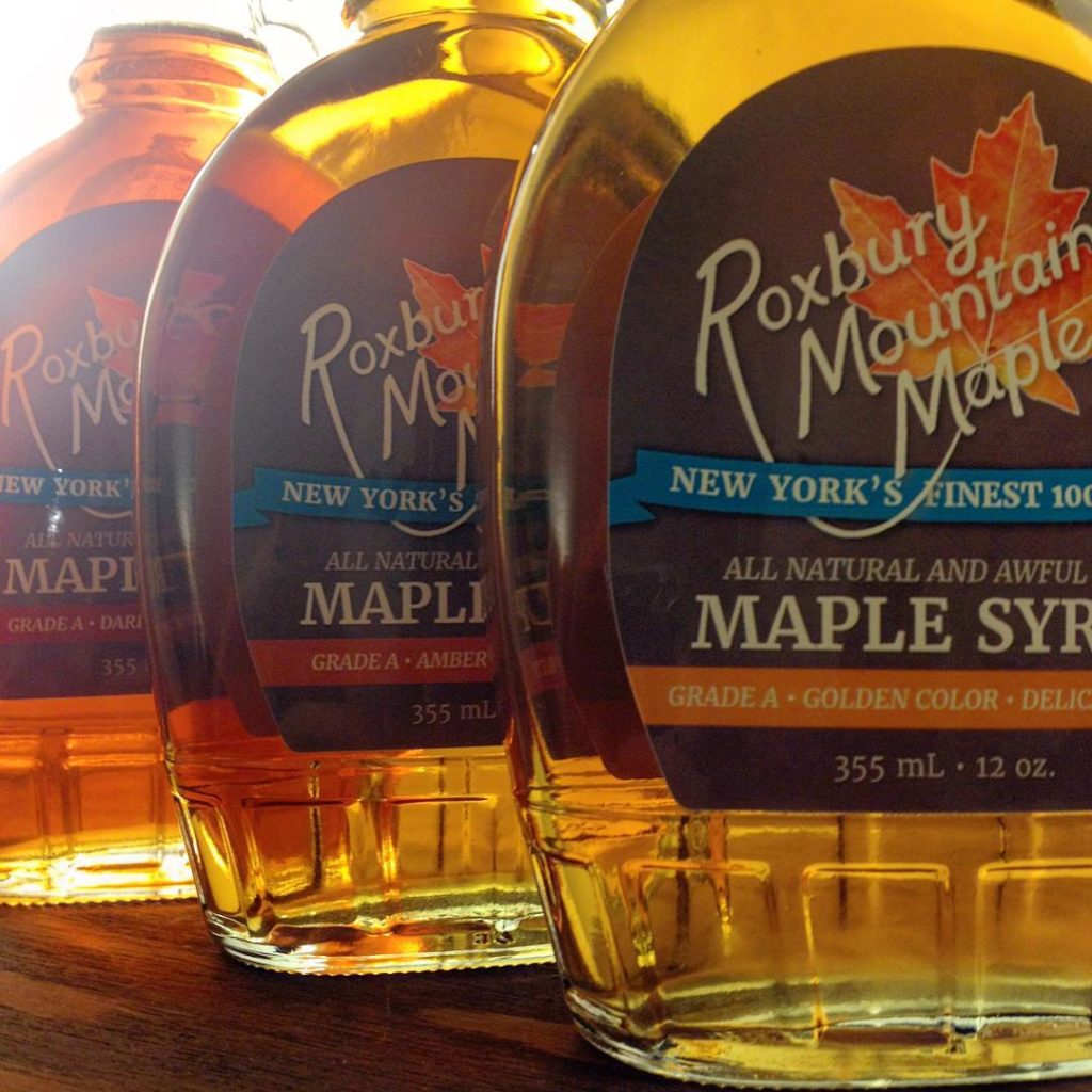
Their most recent brand refresh, in early 2015, was partly inspired by a label redesign in one of my favorite design-as-problem-solving stories. Dave Holscher, the owner, wanted the varying colors of real maple leaves, a design that would “jump off the shelf,” and colors that would say “maple” and “traditional farm” but also “fresh” and “exciting.” I struggled to produce a design that met all those requirements while avoiding gradients, skeuomorphic textures, and design cliches. The final solution? We used gray as a refined color that would allow both the logo and the syrup itself to pop, and we used an image of a leaf as a texture in the design. The resulting series of labels is among my favorite design accomplishments, the more so since I designed the updated lettering almost from scratch.
(Do you like it, too? And do you like the best-tasting thing in the world? You can buy the Holschers’ maple syrup and cream, labels and all, on Amazon. You can also see older versions of the logos on some of the products there.)
Huge thanks for permission to use the maple cream label photo at the top goes to the generous Alexa Schirm of Simple Roots Wellness. I don’t think I could ever make a galette quite that pretty. And while we’re on the subject of giving credit, I should note that while the label in her picture features the branding I designed and is closely based on the labels I created (see the rest of the photos, which are both my designs and my photography), Roxbury Mountain Maple produced that particular label without my direct assistance.
To end with a bit of tangential advice, if you ever have a chance to design for a maple company, I recommend you take it. The benefits are delicious.