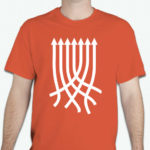
One project that I tackled this past summer was the designing of an identity for a Christian group on the Hillsdale College campus. Hillsdale Christian Fellowship was reorganizing under the national organization InterVarsity, and they wanted their own logo designed in time for their kick-off event at the beginning of the year. To represent the purpose of IVHCF to unite different Christians on campus around their shared beliefs without discounting their differences, I developed the concept of multiple arrows from multiple directions all coming together to point in the same direction. The arrows didn’t become one—like the Pentecostals, the Lutherans, and the Catholics on campus, they remained distinct—but they were unified in their direction.
I expanded the concept from the logo for the t-shirts I designed for IVHCF: Instead of the three arrows in the logo, I used seven. I try to make each of my design decisions based on a logical reason, but while I like to claim that the reason I picked orange for the shirts is that I wanted something eye-catching and exciting, I suspect the main reason is simply that orange is my favorite color.


